
Indoor signs

7/23/2019
Wayfinding Signs and Graphics
Without signs we would run around in circles trying to find directions. Wayfinding signs are as simple as street name signs, addresses, signs on unfamiliar buildings, offices, restaurants, and general navigation around an area to avoid confusion. If your office is difficult to find, or your name is not in the lobby you may frustrate your clients into leaving.
Wayfaring signs offer a route to get to designated spaces while improving efficiency, accessibility, and safety. Curtail stress and anxiety from clients when they fear being late for an appointment.
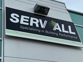
Signs and graphics are used for so much more. Color, size of signage, and readability are key factors to effective signing. Your signs are your branding. Think golden arches for McDonald’s, green tractors for John Deere or robin egg blue color for Tiffany. Color is noticeable and is part of the branding and wayfinding. Your choice of brand color is significant and should be included in all your marketing. Red will always draw attention but is very bold.
Creating short passages with signing instead of long hallways makes your client feel less overwhelmed. Bright signage directing the path along the way keeps the client engaged. Signs also create a memorable experience with a unique identity. Its important to use the signs to create the desired effect you want. Limit choices to the path you would like seekers to take.
Is your sign large enough to read on road by vehicle or without putting on glasses while walking? Signage should be a big as you can manage for visibility. Bigger is better!
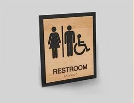
Lastly, is the sign legible? Are the colors used compatible with each other, so your message stands out? The font must be legible and suitable for the format. Script is not generally used for signage with the difficulty reading the message. Preferred fonts include Helvetica, Verdana, and Futura since they are the easiest to read at a glance. For every 10 feet of viewing distance, the font should be 2.54 centimeters.
Remember, if you have more than one venue, ensure your wayfinding signs are alike to keep consistency with the branding.